

Personalizing Amazon
Sr UX DesignerPersonalizing Amazon
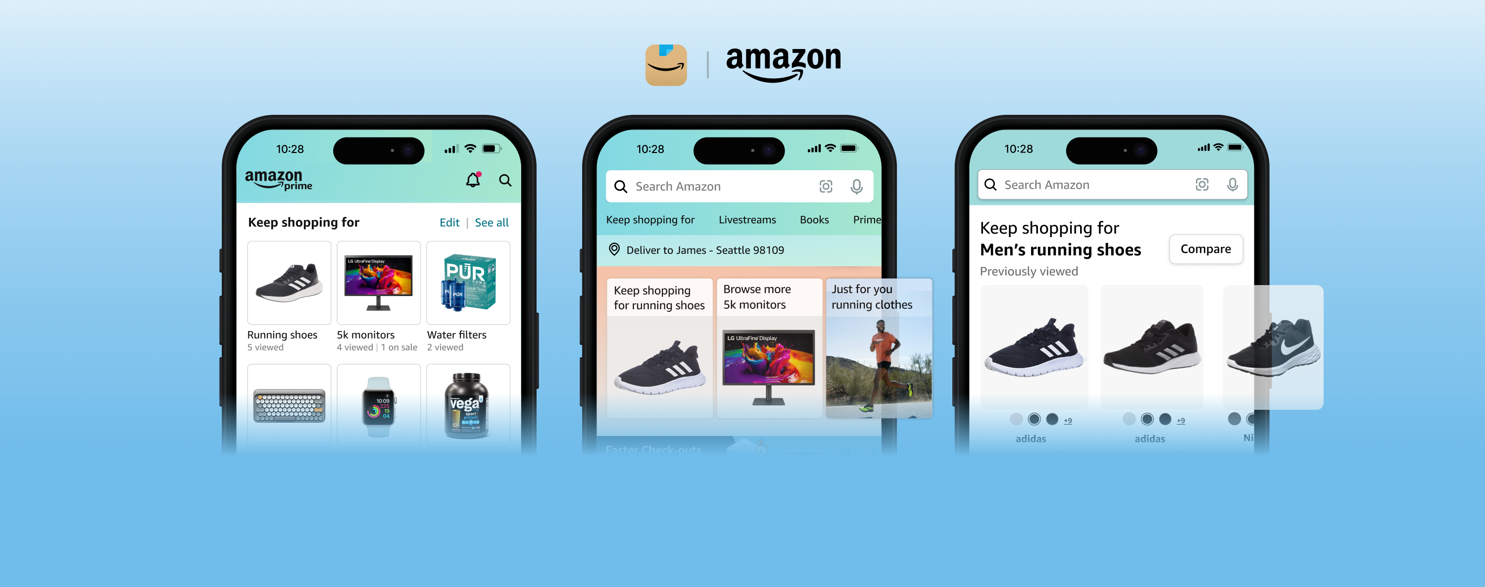
The problem
A major issue customers face when shopping on Amazon is the overwhelming abundance of choices, making it difficult to confidently find relevant products quickly. Customer are left to filter through products inefficiently and repeatedly input preferences, leading to a time-consuming and less enjoyable shopping process that aren’t easily picked-up at a later time.
Timeline
August 2021 – May 2022
Role
Lead Sr. UX Designer
Amazon / Personalization & Shopping Design
Research
Existing UX & Research Insights
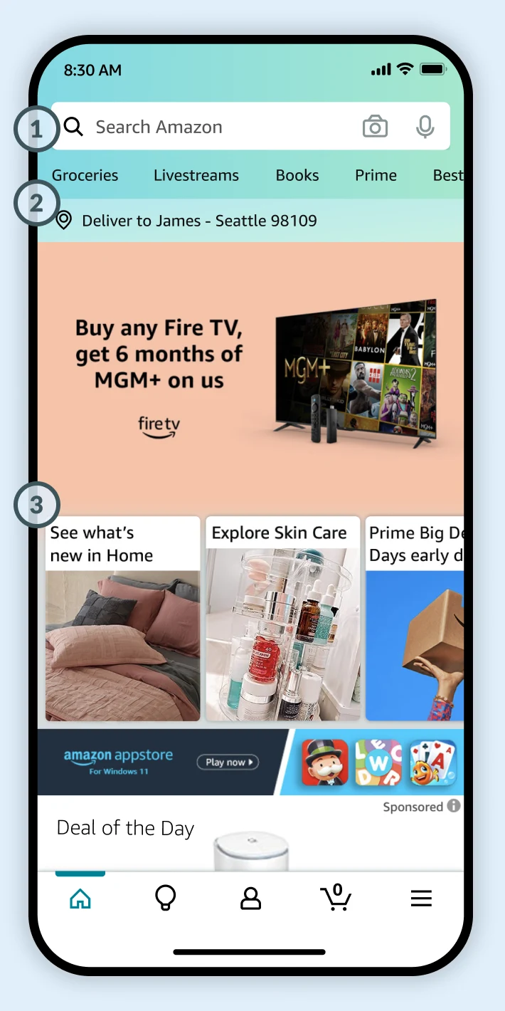
- Top clicked feature Customers most commonly interact with search if nothing on the landing page catches their attention.
- Unhelpful navigation Categories in the top nav are static, resulting in irrelevant links for some customers.
- Mistaken for ads Customers saw dashboard cards as generic ads, since they lacked relevance to interests, needs, or preferences.
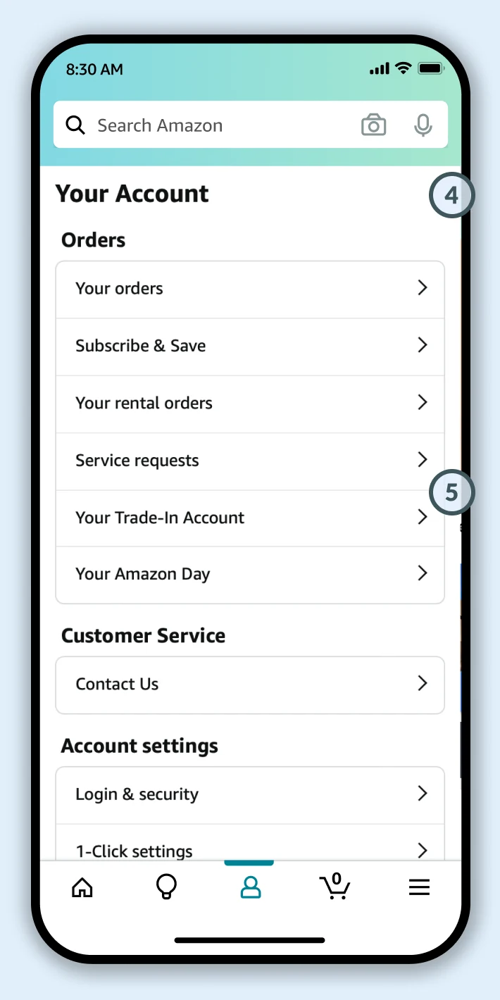
- Undiscoverable browsing history Customers expect to find their browsing history closely tied to their account settings.
- Vast amount of settings The account settings menu requires time and effort for customers to understand and navigate, with browsing history nowhere on the list of options.
UX Research
Understanding the problem
I reviewed prior studies that included customer anecdotes and engagement metrics specifically focusing on browsing history and relevancy of recommendations. The hope was to identify opportunities for leveraging customer intent and personalization to improve the experience.
Stop showing me products I’ve already bought! I don’t need any more toasters… or TVs… since I bought them on Amazon already.
Research
Discovering opportunity
I found examples of personalized shopping experiences to inspire and reference as I moved into designing.
-
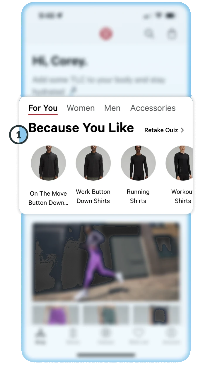
A feed of recommendations based on engagement
-
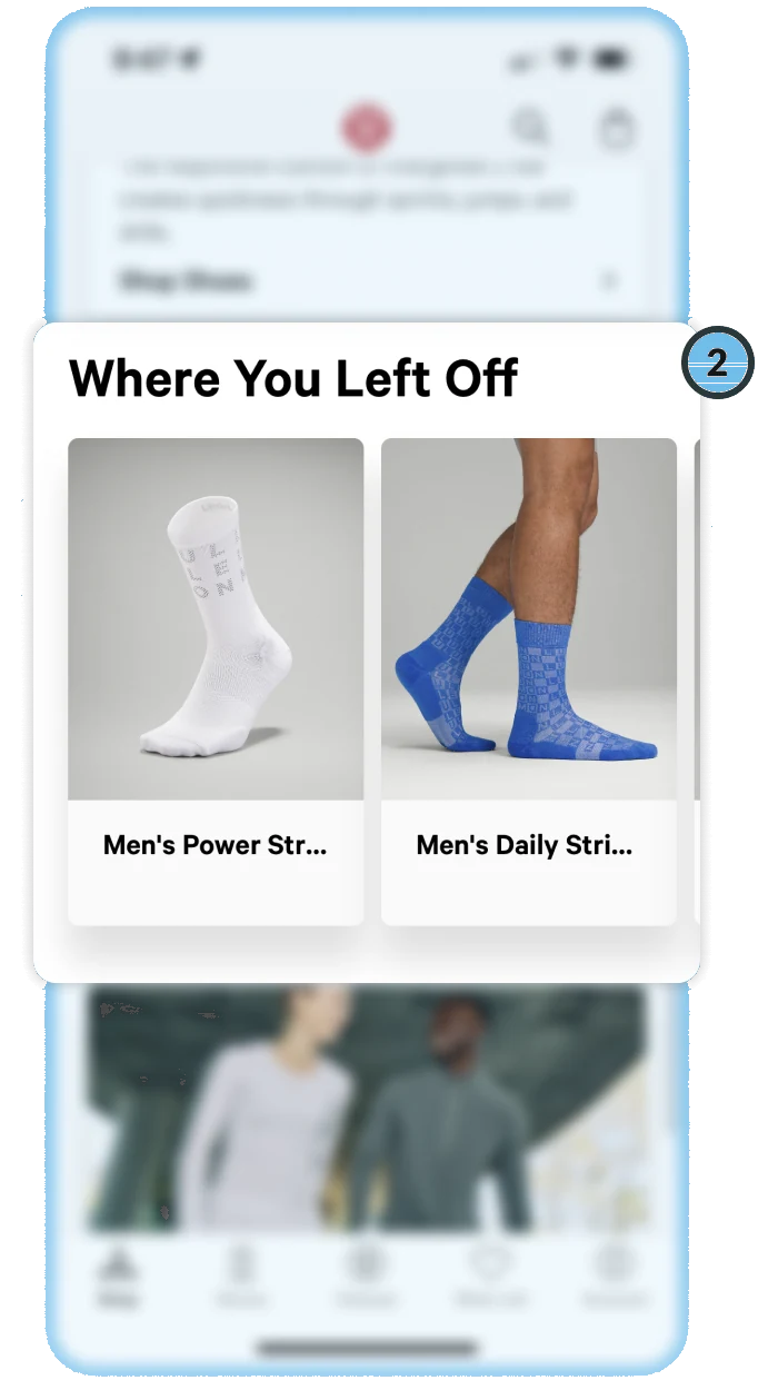
Recent browsing history easily discoverable
Common themes
-
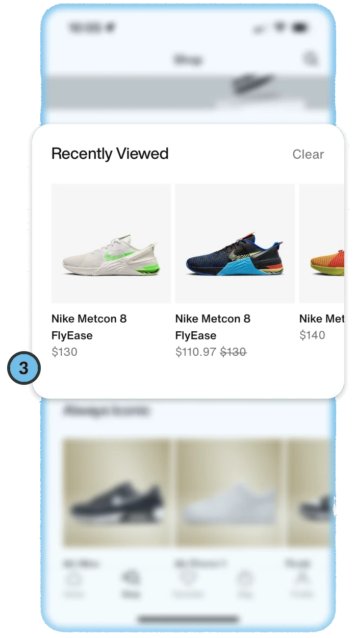
Highly-visible browsing history with prices / sales
-
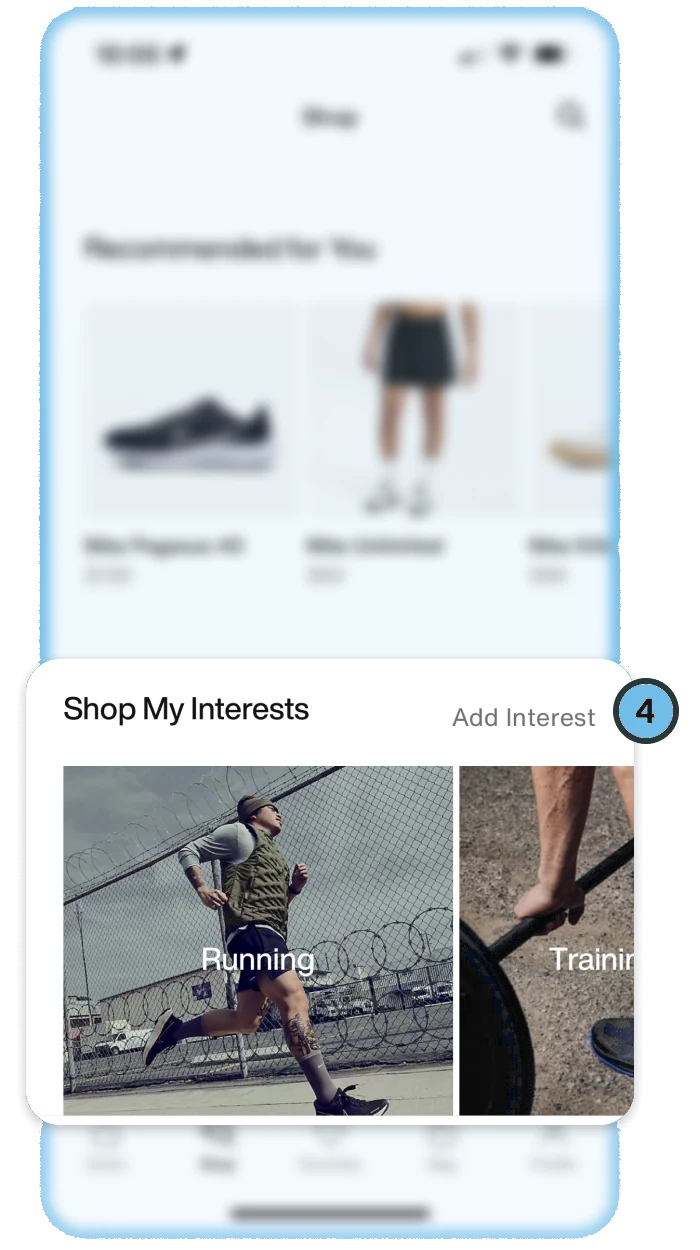
Interest based shopping helps build community and identity
Ideation
Wireframe Explorations
I started from a high-level view of how customers typically start their shopping journeys on Amazon to understand areas of opportunity to incorporate personalized content, when relevant to the customer’s intent.
Product Goals
- Re-engage with recently browsed categories
- Universal ingress
-
Search – Empty state 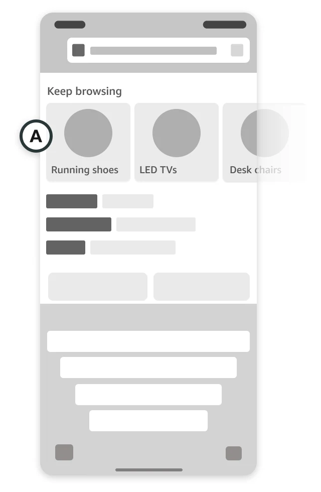
-
Search results 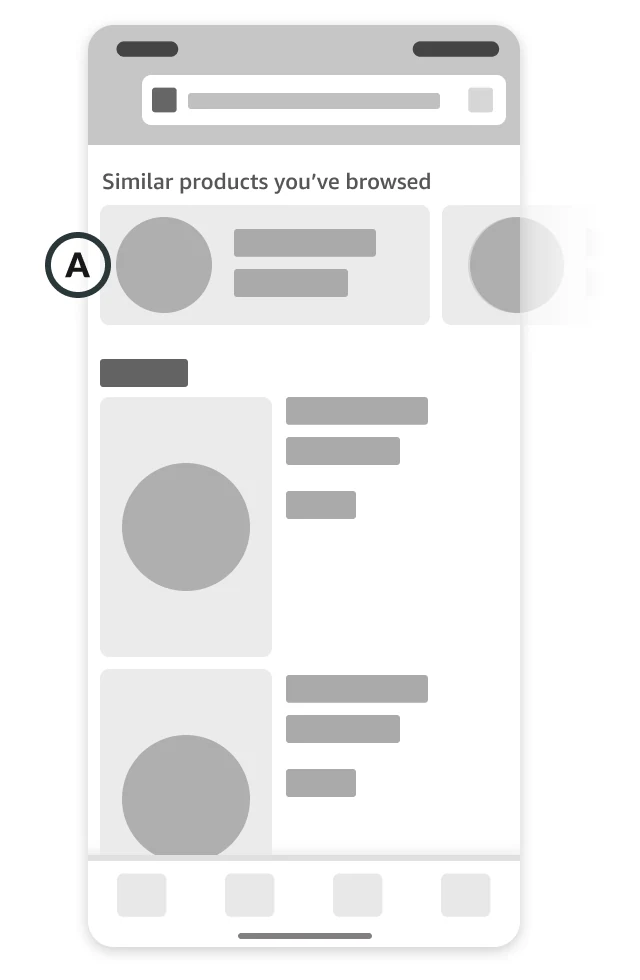
Customer Journey Flow
- Homepage
- Global Nav
- Search
Product Detail Page
Only works if 1 product
Area of Opportunity
When mapping the customer journeys, I noticed an opportunity to take customers to a new type of landing page that could serve several benefits.
Benefits of a Landing Page
- Re-engage with multiple browsed products
- Easily compare products
- Provide helpful recommendations
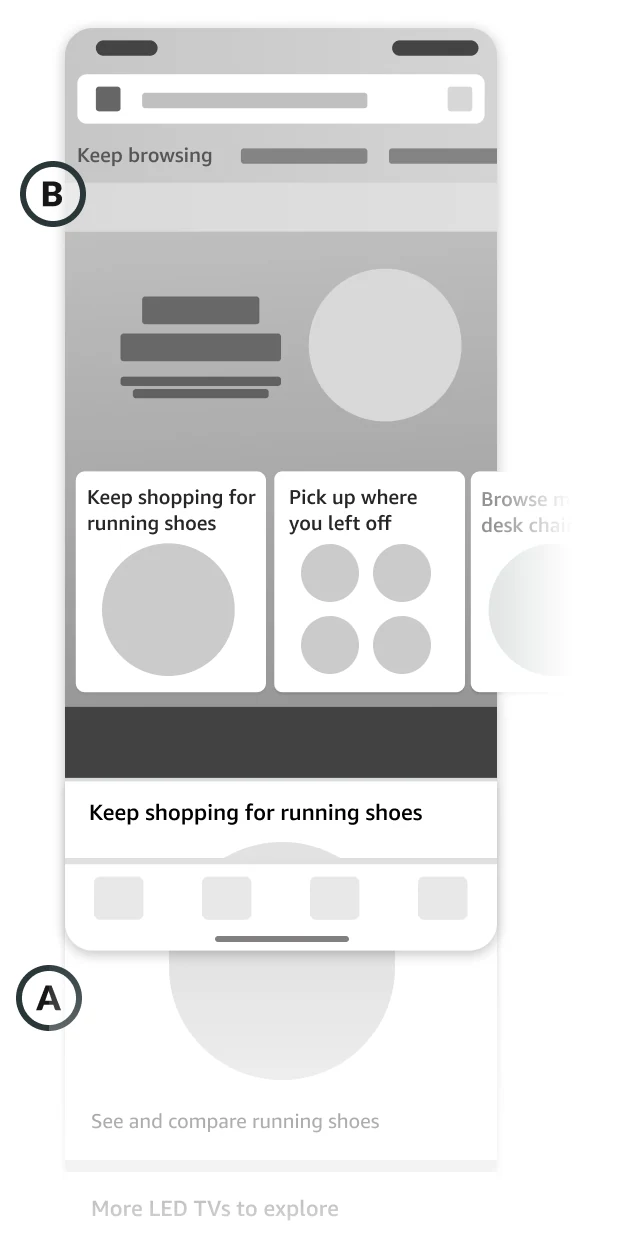
Landing page layouts
Two directions for the new page. Both open on what the customer was just browsing; Layout A follows with what is selling in that category, Layout B with recommendations drawn from the same history. The markers show where each benefit lands.
- Re-engage with browsed products
- Compare products side by side
- Helpful recommendations
-
Landing page – Layout A 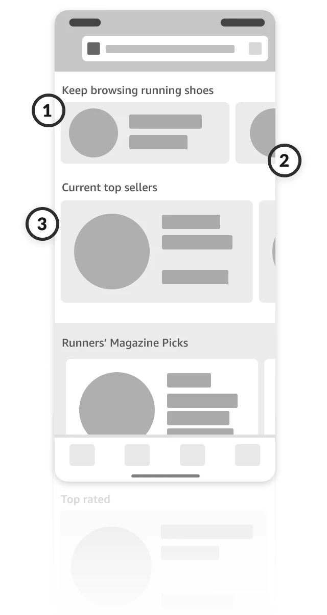
-
Landing page – Layout B 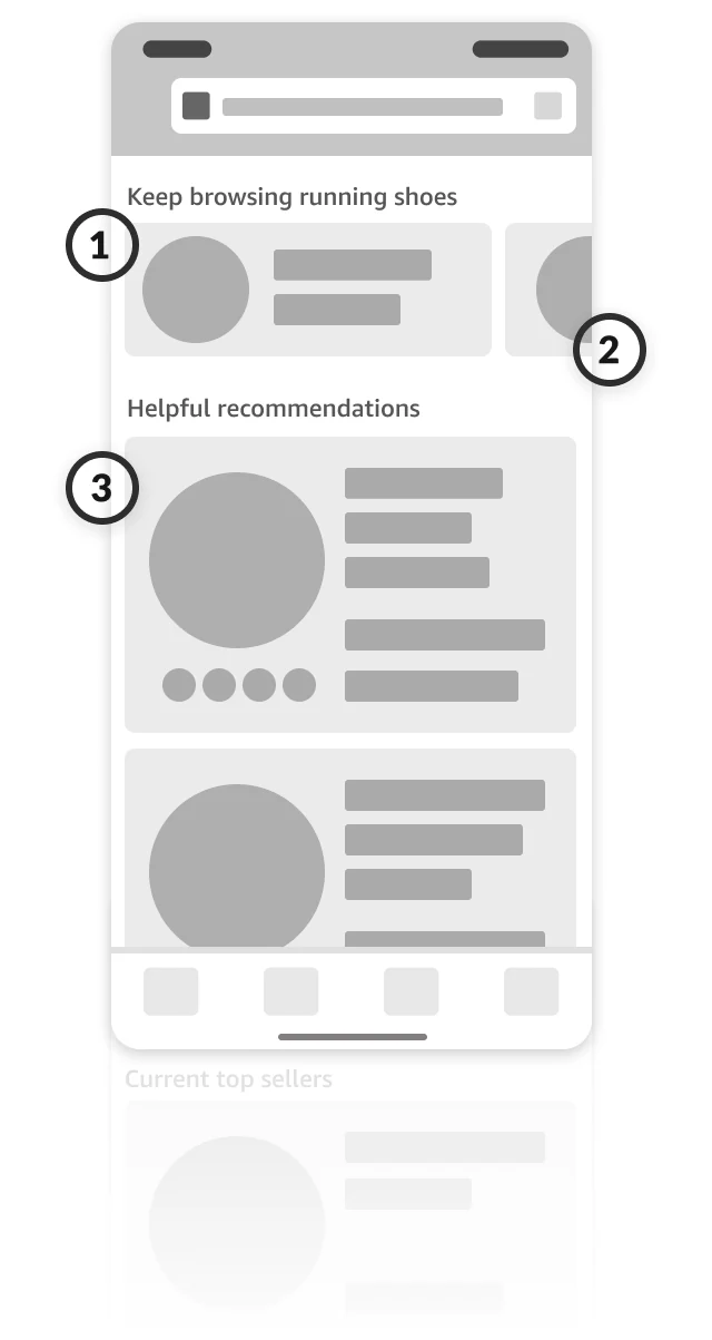
Customer Journey Flow / Wireframes
-
Homepage 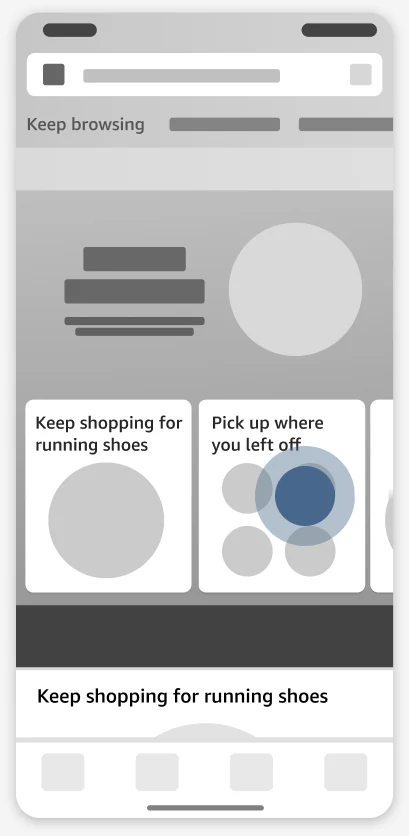
-
Search 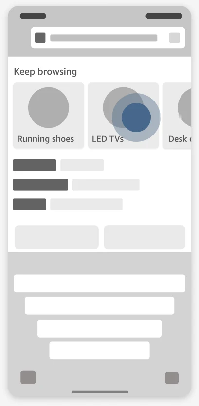
-
Search results 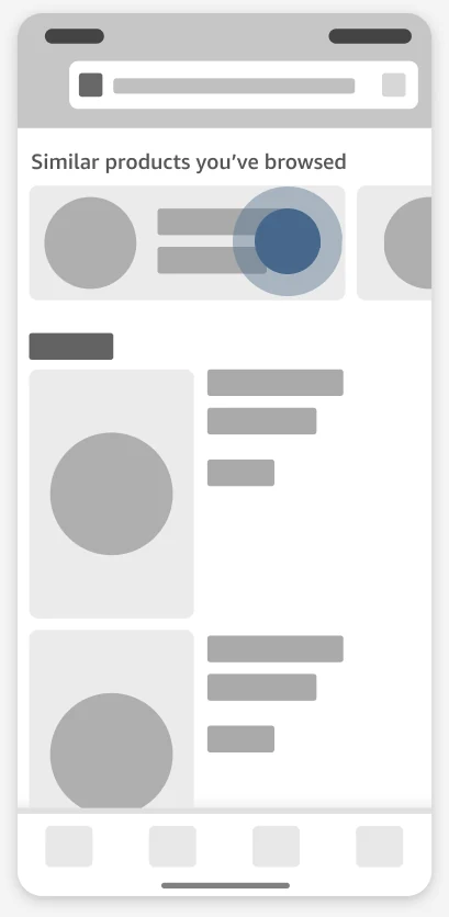
-
Landing page 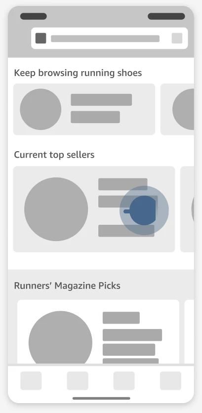
-
Product details page 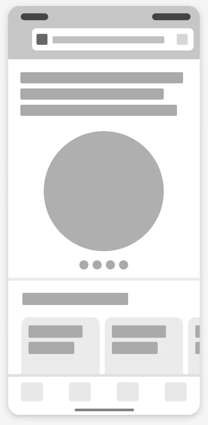
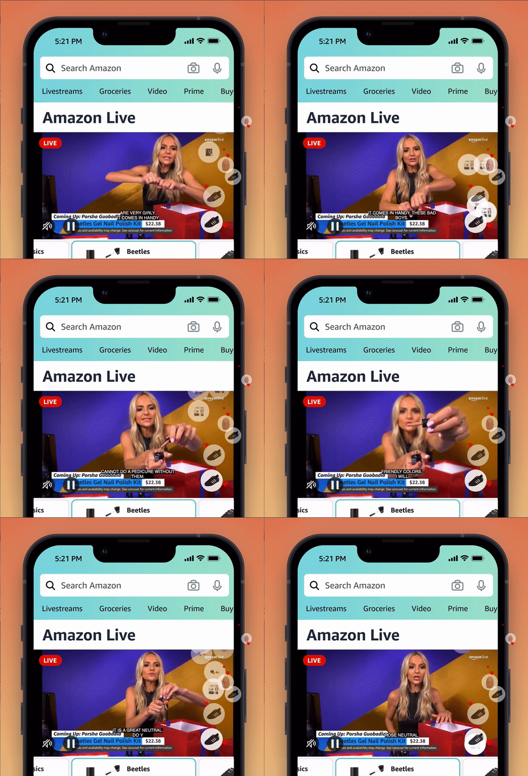 Next project
Livestream Shopping on Amazon
Next project
Livestream Shopping on Amazon