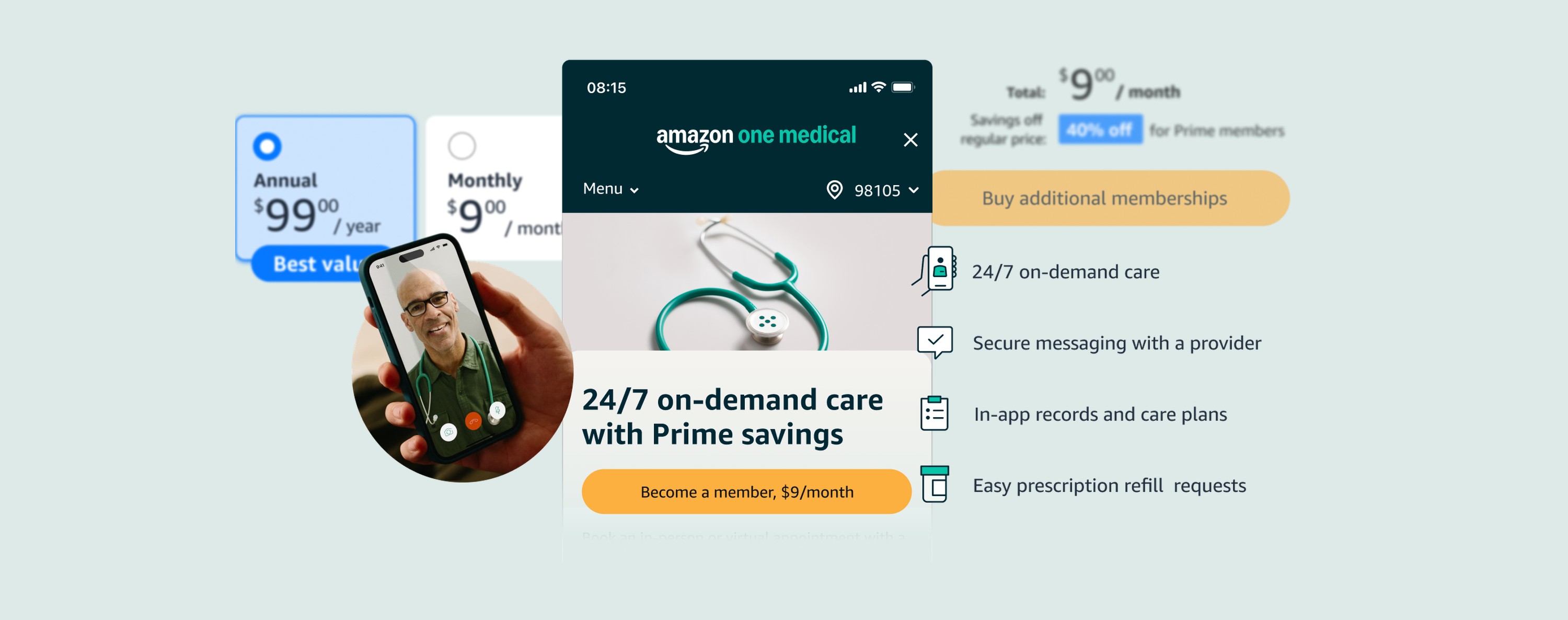
A reusable purchase and management framework, launched for One Medical and later used across 29 condition pages.
Timeline
August 2023 – November 2023Launched
Background
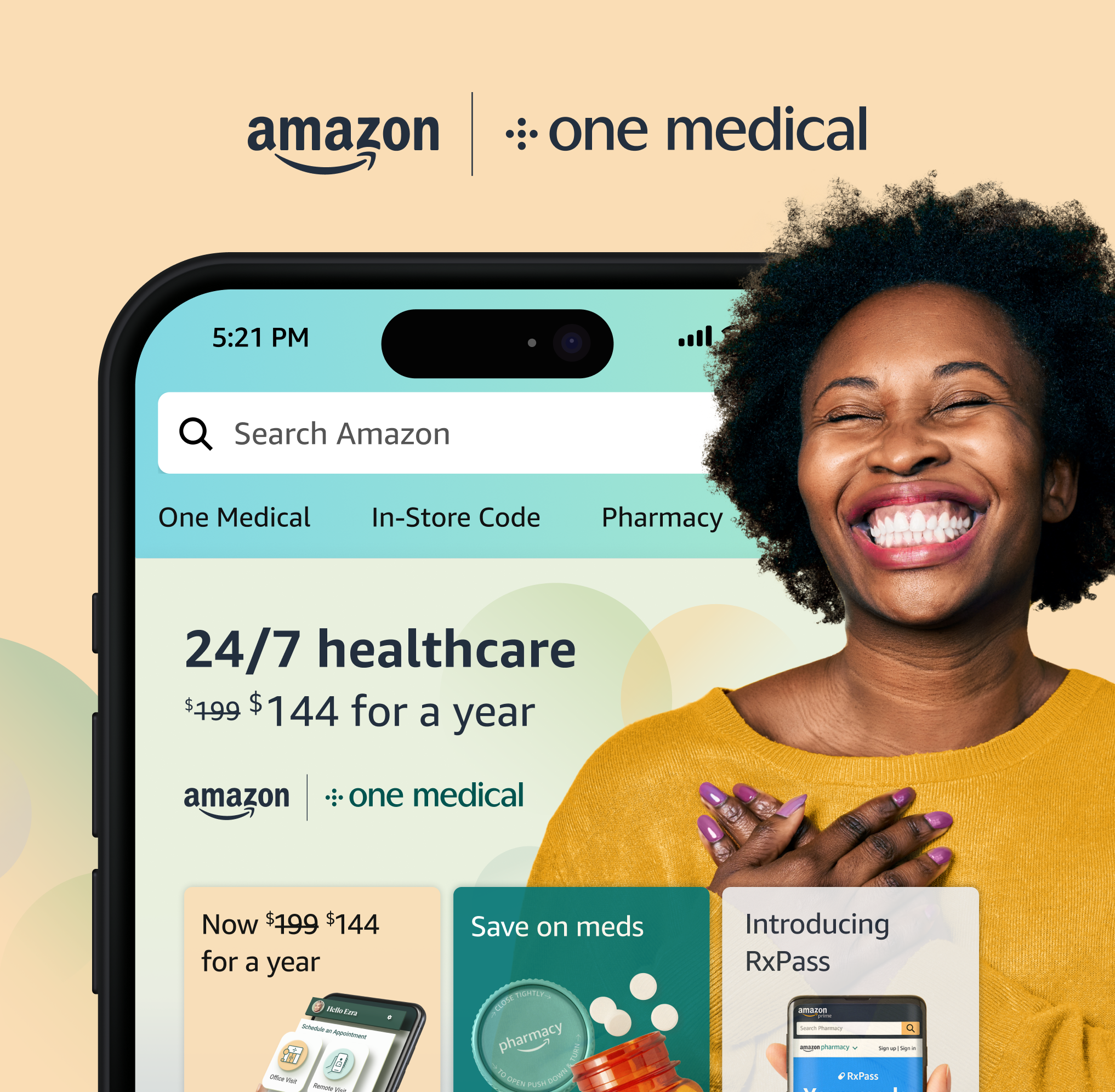
I led UX design for a framework that let customers find, purchase, and manage One Medical memberships within Amazon. The challenge was to make the experience fit Amazon’s existing patterns while supporting future health memberships. The framework launched in November 2023 and was later used across 29 condition pages.
Brand
Role
Lead Sr. UX Designer
Timeline
August 2023 – November 2023Launched
Tools
Figma
UserTesting
dscout
Customer Problem
Customers need an easy way to find, buy, and manage One Medical memberships on Amazon.
Business Problem
Amazon needs a scalable way to sell and manage One Medical memberships that fits into the current ecosystem and allows for future health membership integrations.
What Success Looks Like
The goals we set for launch
4k
Memberships sold on day one
20%
Of One Medical members moving to Amazon by the end of 2023
UX Research
What Exists
I audited similar purchase and membership management flows on Amazon to identify patterns, themes, and opportunities for designing the One Medical membership experience.
1
2
Themes & Patterns
1
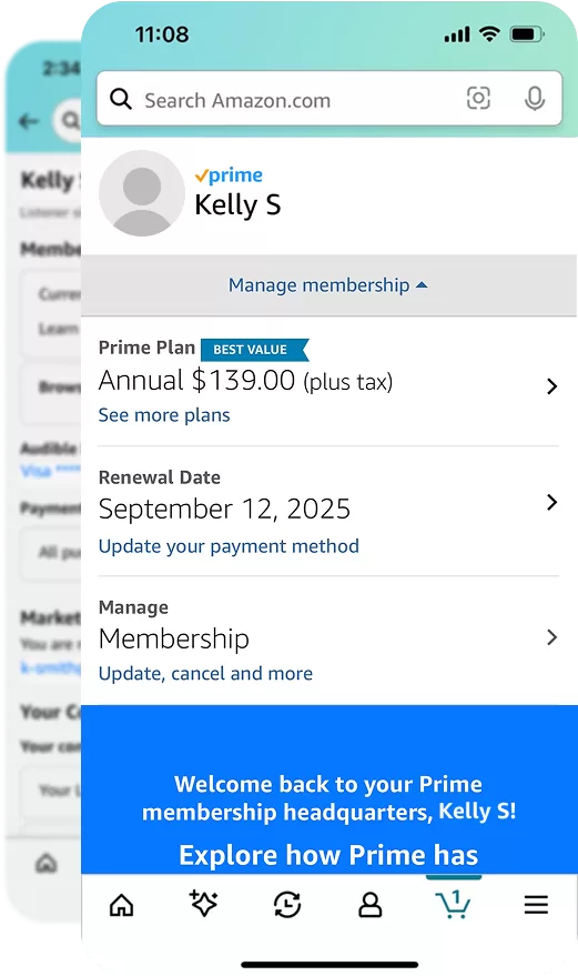
Management of Amazon’s Memberships
Memberships on Amazon like Prime and Audible follow a consistent hierarchy and treatment of content.
2
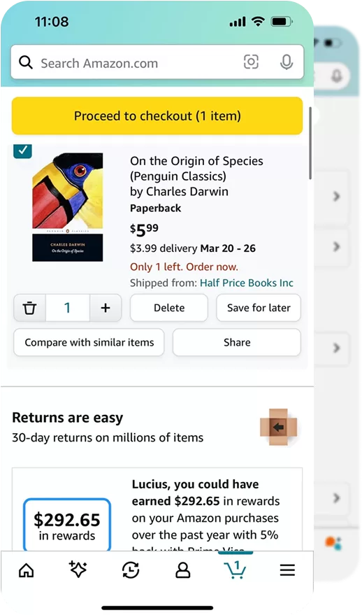
Purchasing Products
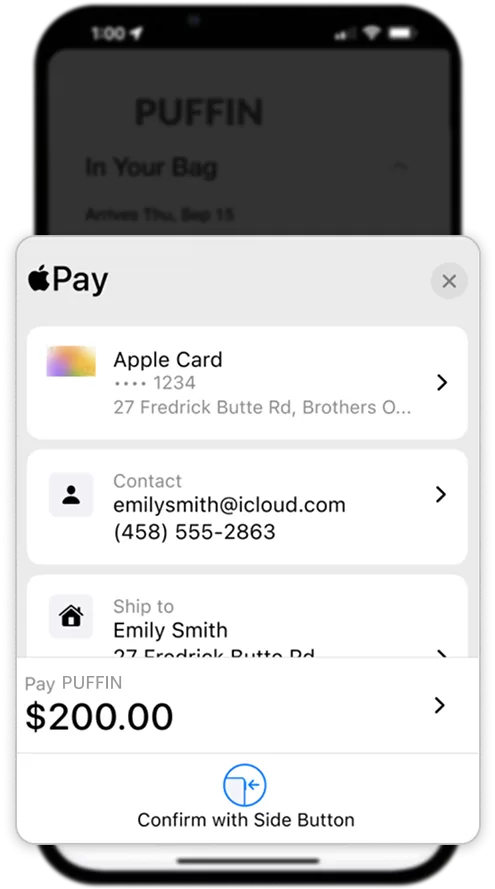
Amazon has several different checkout flows; including Buy Now, Amazon Pharmacy Checkout, Amazon Fresh Checkout, and more.
UX Research
What Inspires
To help define the ideal user experience, I also examined relevant off-Amazon experiences. I identified examples of intuitive design and inspiring interaction and UI patterns that could be adapted for the membership framework.
1
2
Ideas
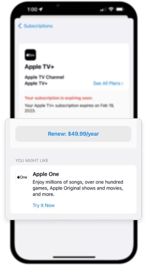
1
Restarting membership with a click of a button, plus recommended additional content.
2
Checkouts that keep customers within experience, providing an ability for continued engagement post purchase.
Additional Suggestions
Common ways of demonstrating value of memberships include offering an ability to try it free or discounted for a period of time as well as gifting memberships.
Guiding Tenets for One Medical memberships on Amazon
UX tenets keep the team focused on what matters most to customers, serving as a shared compass to guide design decisions and create a more seamless experience.
Establishing Tenets
I led a stakeholder workshop to agree on tenets for speed, clarity, privacy, and future reuse. We used those tenets to evaluate trade-offs throughout the project, rather than revisiting the same questions with each design decision.
Our Tenets
1
Prioritize Speed, Not Urgency
A fast path to care is key, but customers should have enough context to feel confident before committing.
2
Be Clear, Not Just Simple
Language should be clear, concise, and customer friendly.
3
Easy, But Secure
We must balance convenience with privacy and meet security requirements of health information.
4
Build for Today & Tomorrow
We optimize for One Medical now, but design a flexible system that supports future health memberships and services.
5
Respect Healthcare Expectations
The experience should feel familiar within Amazon, but we must adapt to healthcare’s unique trust, privacy, and compliance needs.
Design
Mapping The Experience
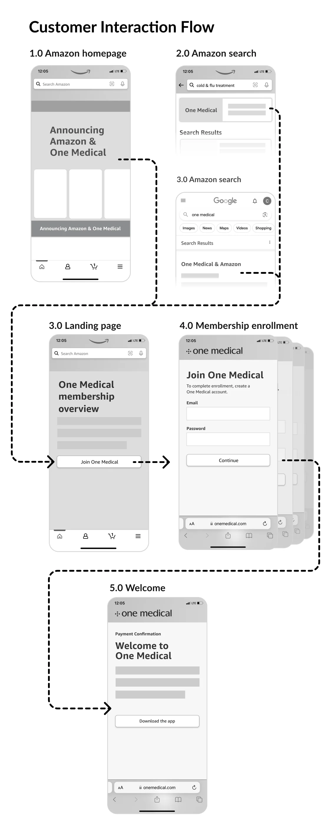
I created low-fidelity flows to explore where purchase and enrollment should occur—on Amazon or One Medical—evaluating trade-offs to help define our MVP for launch. A recommended flow was agreed upon by the team based on the customer experience and technical feasibility.
Jobs To Be Done
Impact On Designs
Easily and quickly get care
Learn about the membership to make a confident purchase choice
Start accessing the benefits, such as care, immediately after joining
Seemless purchase to setup flow
Membership details easily discoverable on Amazon
Simple enrollment with guidance post purchasing a membership
Outcome
What came of it
6.3KMemberships sold in the first two days
54%Chose the annual plan
1.2Memberships per Prime household
29Condition pages now check out through it
Learnings
Looking back
Tenets earned their keep. Writing them with the stakeholders before any screens existed meant later trade-offs were settled against principles the whole team had already agreed to, rather than argued from scratch.
Where the purchase happens shapes everything after it. Mapping the flows on Amazon and on One Medical side by side showed that the hand-off between the two was the experience, not a detail of it, and it set the MVP.
A framework pays off after launch. Day one came in at 3.9K memberships against a 4K goal, and more than half of buyers chose the annual plan. The bigger return came later: the same checkout became the way to buy a membership from 29 condition pages, which a one-off page could not have been.