Start with the smallest screen.
Designing for the phone first made the priorities obvious. Scaling up to tablet and desktop was mostly a matter of giving things room, not rethinking them, and the site came out simpler everywhere for it.


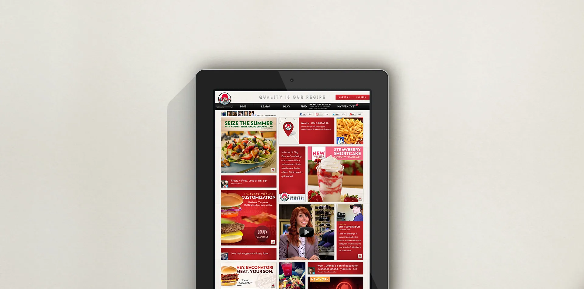
In the early 2010s the phone was fast becoming the first screen people reached for, and for customers in their twenties it was often the only one. Wendys.com was still built for a desktop, so on a phone, finding a menu item, checking what was in it or making it your own meant pinching and zooming through pages that were never meant for that screen. The customers most likely to be deciding where to eat on the go were the ones most likely to give up.
Customers needed Wendy’s where they already were: on the screen in their hand, with the menu, what’s in it and how to make it their own a tap away.
Rebuilding Wendys.com as one responsive site, designed from the phone up.
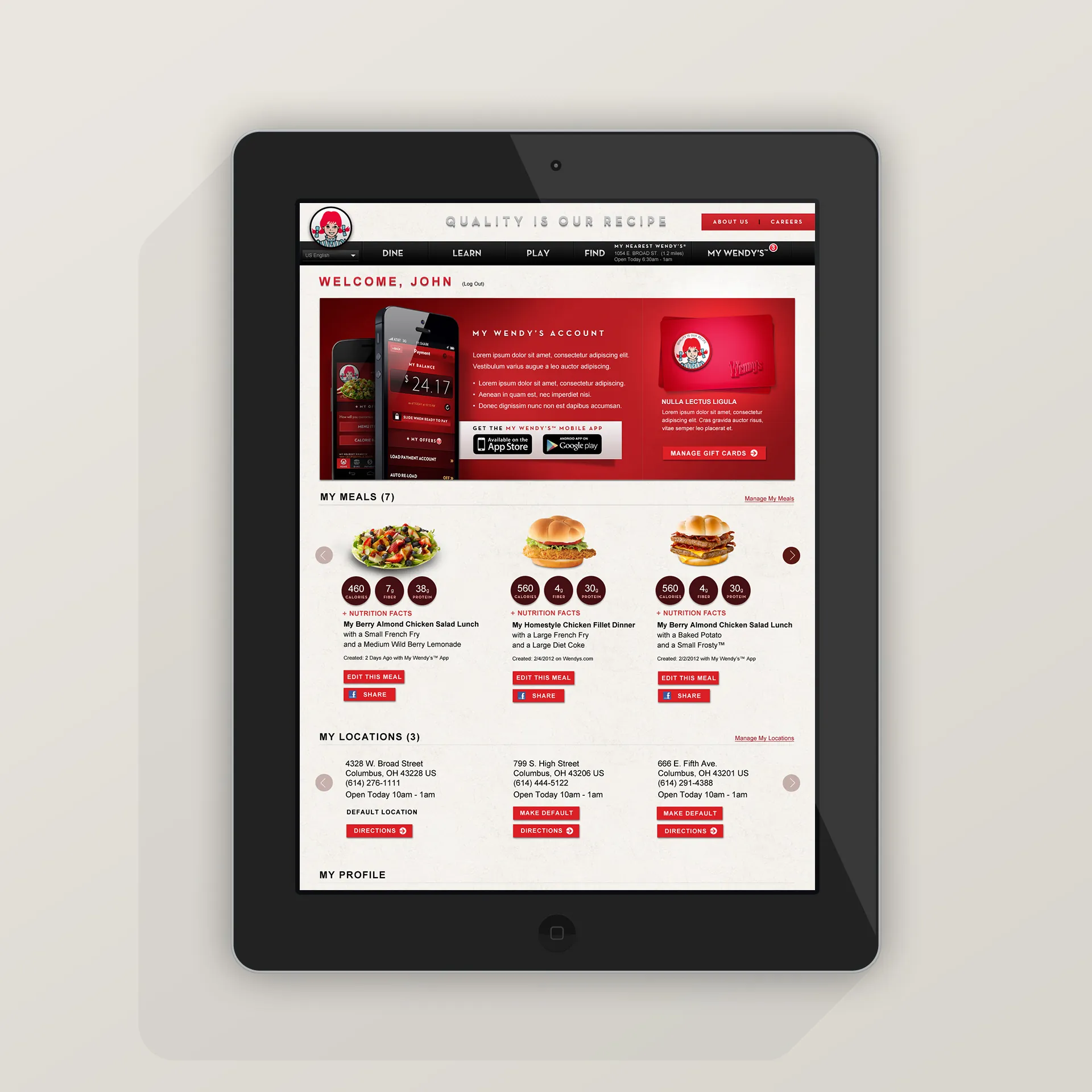
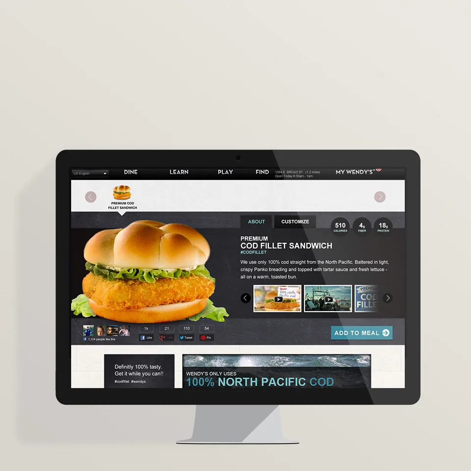
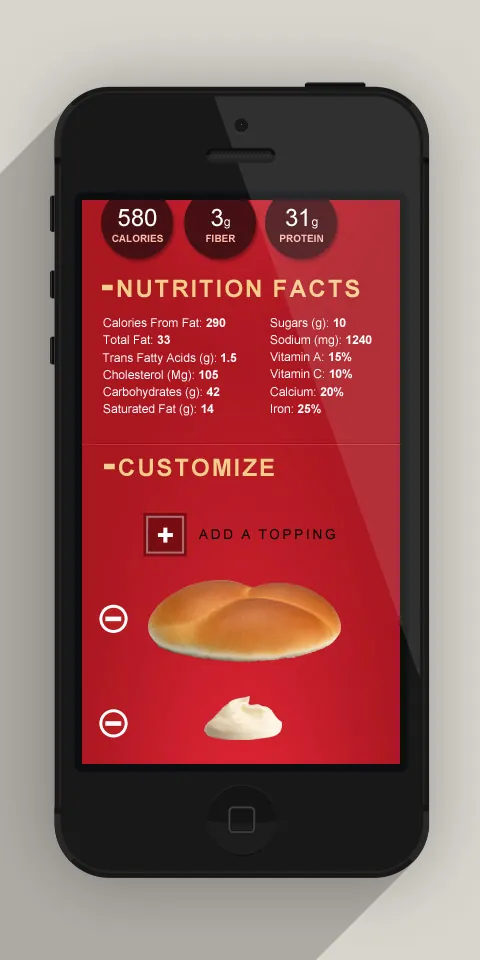
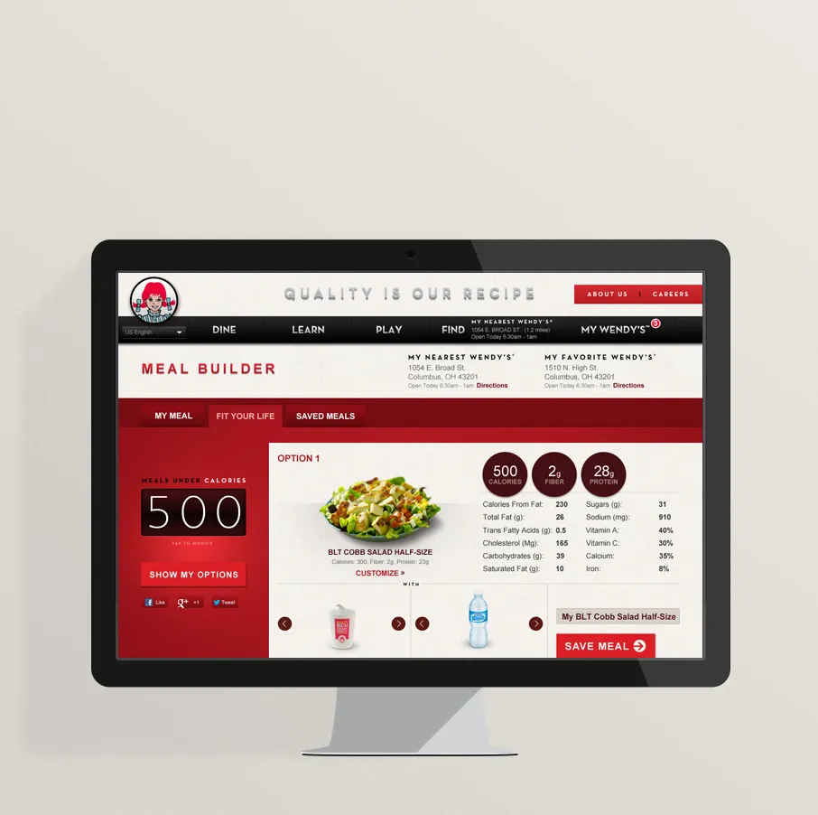
Rather than a separate mobile site, Wendys.com became one responsive site, designed from the phone up. Starting at the smallest screen forced the hard choices early: the menu, nutrition and ordering came first, and everything else had to earn its place. Menu items became large, tappable cards; a customizer let people build their meal a topping at a time; and its nutrition added up as they went, so the facts people wanted were part of choosing rather than a separate lookup. The same pieces then scaled up to tablet and desktop, which gave the site one design system instead of three.
Outcome
Learnings
Designing for the phone first made the priorities obvious. Scaling up to tablet and desktop was mostly a matter of giving things room, not rethinking them, and the site came out simpler everywhere for it.
Nutrition that added up inside the customizer did more than a nutrition page ever could: people saw what a change meant at the moment they made it.
This is a unique website which will require a more modern browser to work!
Please upgrade today!